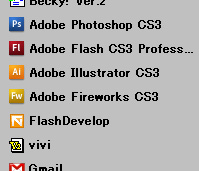
 のアイコンを並べて配置すると押し間違えが多発する。アイコンのデティールは選択時の判別において、あまり重要で無いということを身をもって体感できる。これにpopFileやmixiのアイコンなんか並べたら更に分かりにく使いにくくできそうだ。
のアイコンを並べて配置すると押し間違えが多発する。アイコンのデティールは選択時の判別において、あまり重要で無いということを身をもって体感できる。これにpopFileやmixiのアイコンなんか並べたら更に分かりにく使いにくくできそうだ。
We use cookies to improve your experience on our site. By using our site, you consent to cookies.
Manage your cookie preferences below:
Essential cookies enable basic functions and are necessary for the proper function of the website.
These cookies are needed for adding comments on this website.
Google reCAPTCHA helps protect websites from spam and abuse by verifying user interactions through challenges.
Google Tag Manager simplifies the management of marketing tags on your website without code changes.
Statistics cookies collect information anonymously. This information helps us understand how visitors use our website.
Google Analytics is a powerful tool that tracks and analyzes website traffic for informed marketing decisions.
Service URL: policies.google.com (opens in a new window)
Marketing cookies are used to follow visitors to websites. The intention is to show ads that are relevant and engaging to the individual user.
A video-sharing platform for users to upload, view, and share videos across various genres and topics.
Service URL: www.youtube.com (opens in a new window)
You can find more information in our Cookie Policy and Privacy policy.
「illustratorとfireworksとflashDevelop」への4件の返信
僕なんかはクイック起動のOutlookとFlash Developのアイコンを押し間違えますよ。並んでもいないのに。
outlookのアイコンって青じゃなかったでしたっけ?
変わったんですか?
Outlookのアイコンは昔から肌色というか黄色というか、そういう感じですよ。
青ぽいのは、Outlook Expressではないかな?
あ、青いのはoutlook expressでoutlookと違うんですね。というかoutlookっつーものを一度も使ったことが無いのだと気づきました。